Sub-brand
Help Nursery
This section serves as your roadmap for navigating the key visual components that define the Help Nursery sub-brand.
For maximum flexibility on different materials and backgrounds, the Help Nursery logo comes in two configurations: inline and stacked.
For maximum flexibility on different materials and backgrounds, the Help Nursery logo comes in two configurations: inline and stacked.
The Help Nursery logo can be deconstructed into its brandmark and wordmark elements, each available in the same colour schemes as the primary logo.
Please note: For optimal legibility, the Mint-coloured wordmarks should exclusively be displayed against a Forest background.


As we plan for future nursery expansions, location-specific tags may be integrated into the primary logo. Although examples are showcased below, please note that these variations are not yet authorised for use.


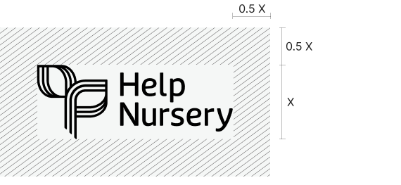
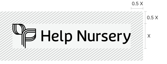
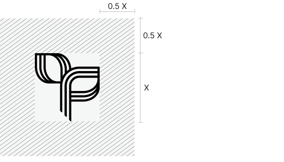
In order to protect the integrity and legibility of the Help Nursery logo suite, an exclusion zone, or safe area, has been created around the logo into which nothing should infringe upon.

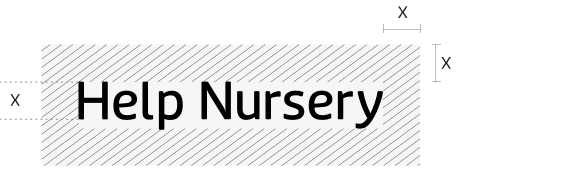
To ensure the logo always appears clear and legible, an absolute minimum size has been set.
The Help Nursery logo components should never appear smaller than detailed here.


The primary colour palette for Help Nursery is derived from the Help Enterprises brand, featuring Forest and Mint as the dominant hues, complemented by a selection of neutral colours.
Forest
PMS 3302C
C90 M50 Y67 K50
R5 G66 B61
HEX #05423D
Mint
PMS 358C
C26 M0 Y40 K0
R190 G235 B175
HEX #BEEBAF
Ivory
C2 M8 Y18 K0
R249 G232 B208
HEX #F9E8D0
Dove Grey
C27 M13 Y21 K0
R187 G201 B196
HEX #BBC9C4
Charcoal
C70 M68 Y63 K73
R36 G31 B33
HEX #241F21
White
C0 M0 Y0 K0
R255 G255 B255
HEX #FFFFFF
The Help Nursery secondary palette is composed of colours from the Help Enterprises palette that aren’t already included in the Help Nursery primary palette.
Ruby
C0 M86 Y63 K0
R255 G61 B74
HEX #FF3D4A
Duck Egg
C30 M0 Y10 K0
R170 G235 B235
HEX #AAEBEB
Lilac
C16 M20 Y0 K0
R209 G201 B255
HEX #D1C9FF
Light Wattle
C1 M9 Y66 K0
R225 G224 B115
HEX #FFE073
Crimson
C5 M96 Y80 K22
R197 G40 B51
HEX #C52833
Ocean
C100 M76 Y28 K12
R0 G73 B121
HEX #004979
Nightshade
C85 M82 Y38 K30
R55 G55 B90
HEX #37375A
Black Olive
C65 M60 Y80 K74
R38 G37 B19
HEX #262513
To preserve alignment with the Help Enterprises parent brand, the Help Nursery employs the same typefaces and incorporates the doorburst and tile graphic devices.
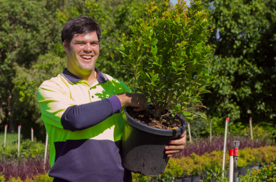
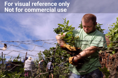
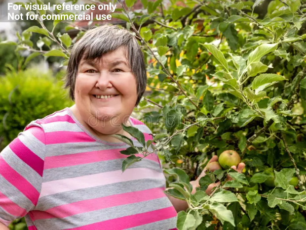
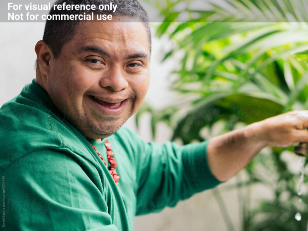
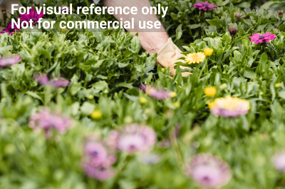
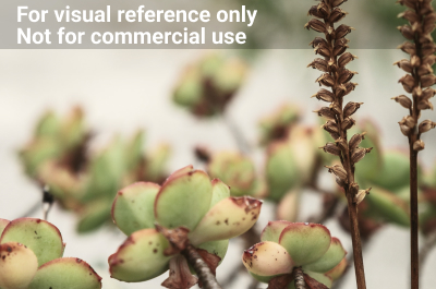
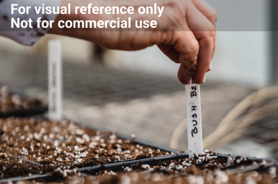
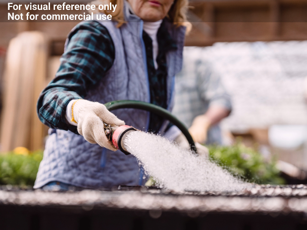
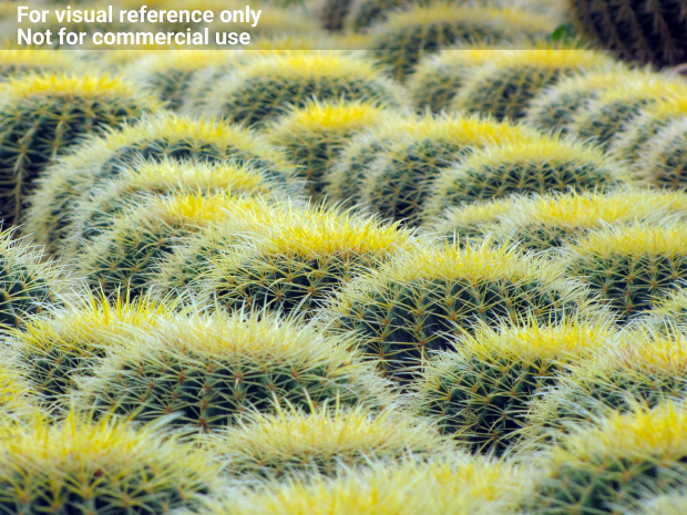
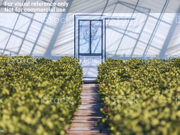
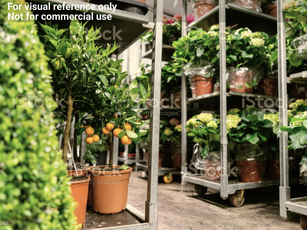
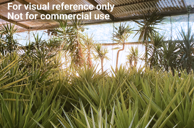
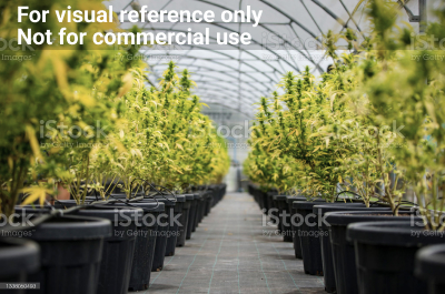
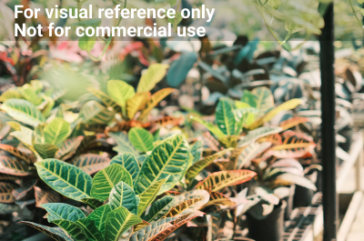
To resonate with its commercial audience, Help Nursery’s photography style subtly diverges from that of Help Enterprises, placing a greater emphasis on professionalism and work quality over human interaction.
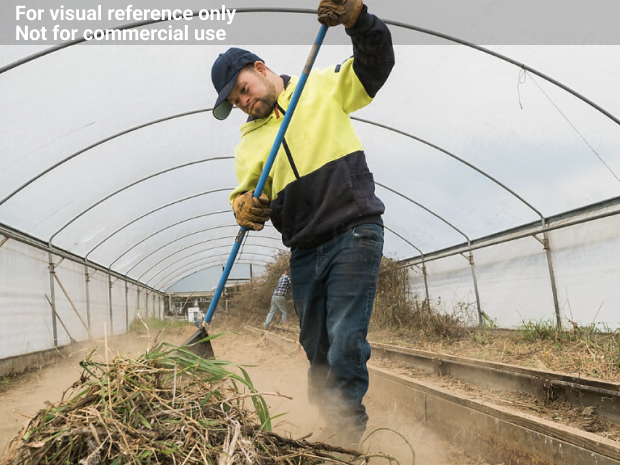
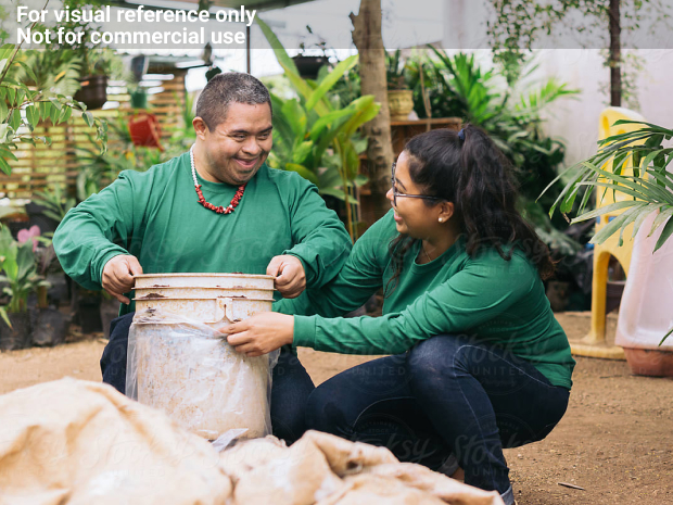
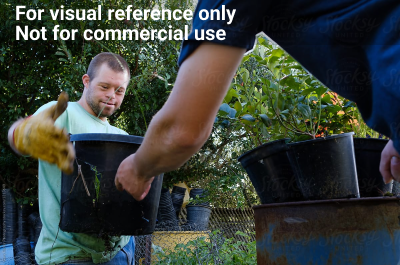


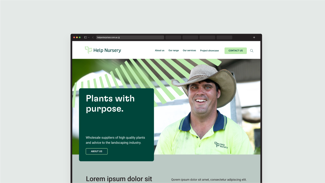
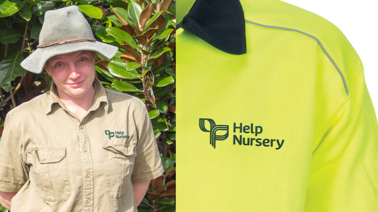
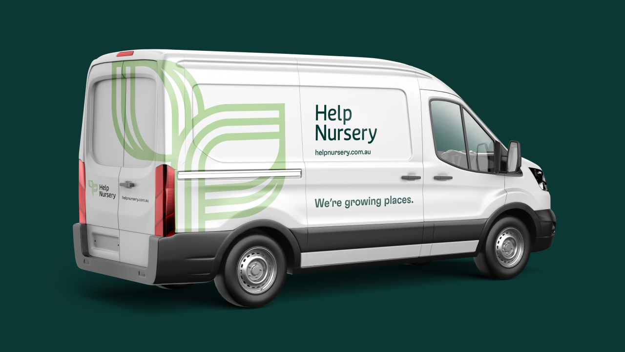
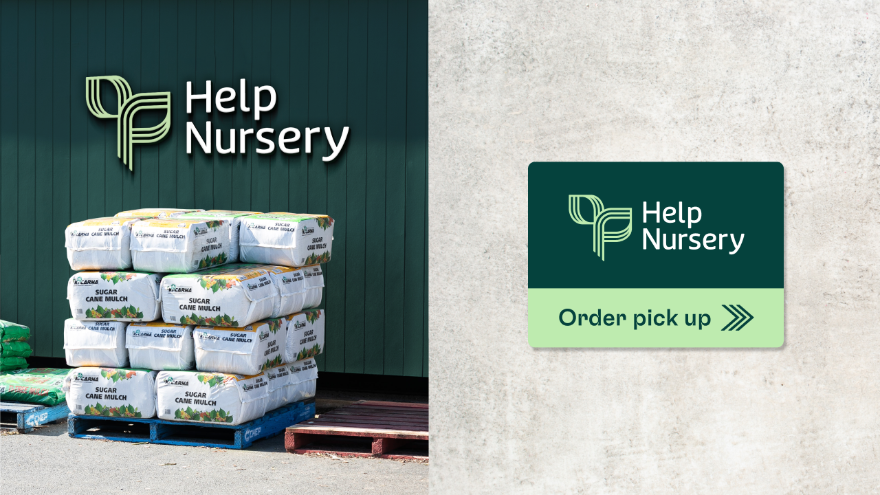
The depictions displayed below illustrate the potential interplay of various brand elements. Please be aware that all examples on this page serve as conceptual mockups and are not intended for use as final artwork.
If you have any questions regarding the brand guide, please contact:
HELP Marketing Team
E: marketing@helpenterprises.com.au
