Visual identity
Colour
Our colour palette is a key part of HELP’s visual identity, helping to differentiate the brand from others in the category, and pay homage to our legacy.
To lean into our legacy, HELP’s red tones include warm and contemporary hues. This ruby red can be used for any headings over 18pt font size to adhere to 2.0 AA accessibility standards. However to meet WCAG 2.0 AA accessibility standards in any use case, HELP’s deep crimson may be utilised. The ivory and dove grey are used to support HELP with more range and flexibility in design applications.
Ruby
PMS 032 C
C0 M90 Y66 K0
R255 G61 B74
HEX #FF3D4A
Crimson
PMS 1805 C
C5 M96 Y80 K22
R197 G40 B51
HEX #C52833
Ivory
C2 M8 Y18 K0
R249 G232 B208
HEX #F9E8D0
Dove Grey
C27 M13 Y21 K0
R187 G201 B196
HEX #BBC9C4
Charcoal
PMS 426 C
C0 M0 Y0 K95
R50 G50 B50
HEX #323232
White
C0 M0 Y0 K0
R255 G255 B255
HEX #FFFFFF
HELP’s secondary palette is expansive enough to allow for our personality and tone to be dialled up and down, across collateral – while avoiding a ‘rainbow effect’.
Duck Egg
C30 M0 Y10 K0
R170 G235 B235
HEX #AAEBEB
Mint
C26 M0 Y40 K0
R190 G235 B175
HEX #BEEBAF
Lilac
C16 M20 Y0 K0
R209 G201 B255
HEX #D1C9FF
Light Wattle
C1 M9 Y66 K0
R225 G224 B115
HEX #FFE073
Ocean
C100 M76 Y28 K12
R0 G73 B121
HEX #004979
Forest
C90 M50 Y67 K50
R5 G66 B61
HEX #05423D
Nightshade
C85 M82 Y38 K30
R55 G55 B90
HEX #37375A
Black Olive
C65 M60 Y80 K74
R38 G37 B19
HEX #262513
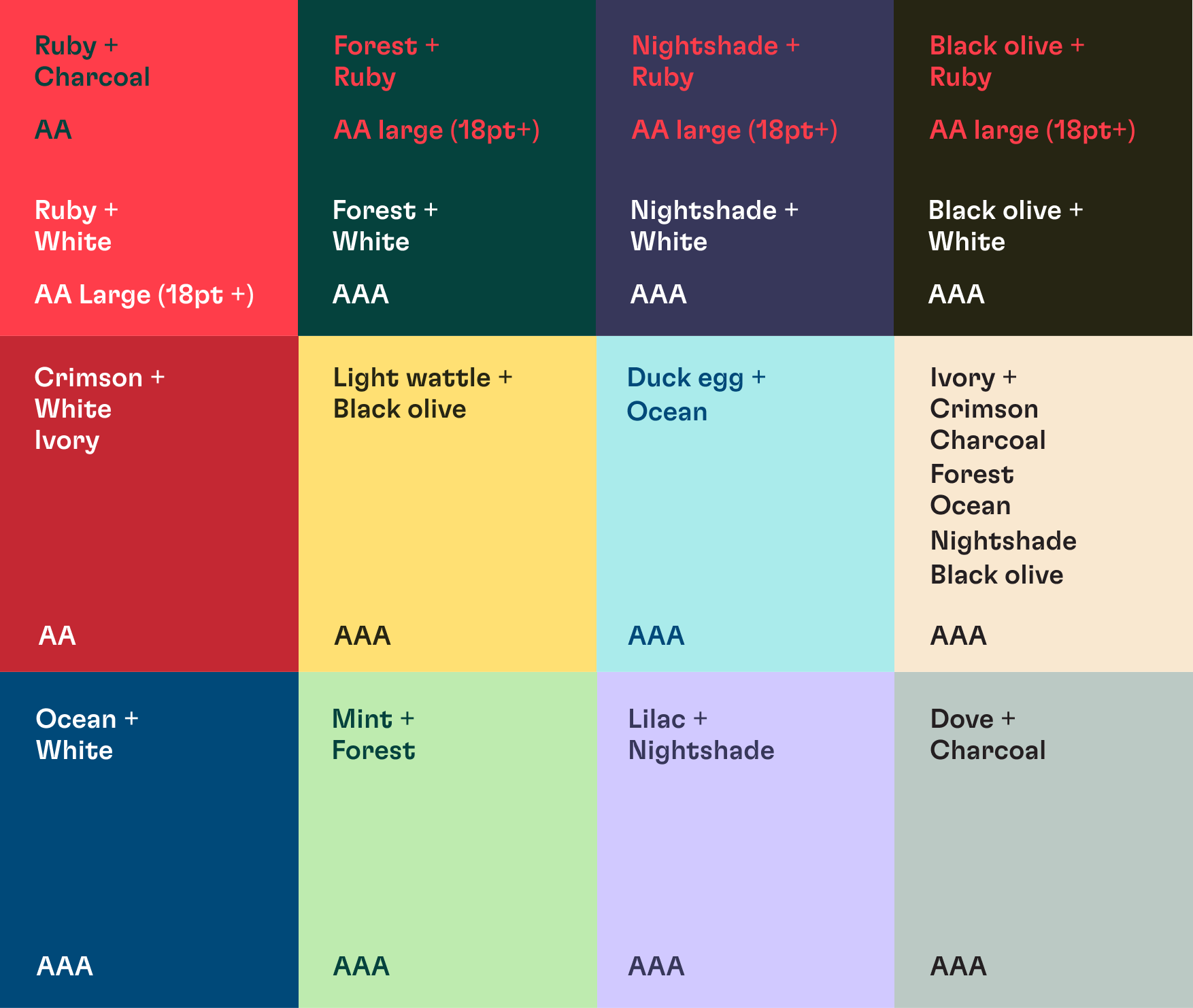
Our colour palette has been created with accessibility in mind, the below details which of HELP’s primary and secondary palette colours may be paired together and still meet WCAG 2.0 AA or AAA accessibility standards. Colour pairings with text that are not outlined in the below should not be used in any HELP collateral – excluding the use of any deeper tone on white.
If you have any questions regarding the brand guide, please contact:
HELP Marketing Team
E: marketing@helpenterprises.com.au
