Brand guidelines - Version 1.0, 2025

Visual identity

Graphic devices

Our graphic devices are used to reinforce our brand’s identity and create striking communications. This section demonstrates how to use these devices to create visuals that offer variation and interest, while remaining on-brand.

Tying in with the rounded corners of the logo, the tile adds visual weight and assists with legibility of copy.

To determine the rounded corner radius multiply the tile width by 5% (x*0.05=corner radius). For example if the tile is 50mm square, 50mm multiplied by 5% equates to a 2.5mm corner radius (50*0.05=2.5mm).

Using the tile effectively

The tile device can either sit on top of an image, or be integrated with it, as shown here by having the subject deep etched and sitting just slightly over the edge of the tile.

The rounded corner style of the tile shape can also be used for image holders.

Incorrect tile treatment

  1. DON’T cover up important parts of the image.
  2. DON’T place the tile where it cuts off someones face.
  3. DON’T use the tile in any colour outside the HELP palette.
  4. DON’T add drop shadows or any other effects to the device.
  5. DON’T use multiple devices one one image.
  6. DON’T fill the tile with too much text.
  1. Incorrect tile treatment
  2. Incorrect tile treatment
  3. Incorrect tile treatment
  4. Incorrect tile treatment
  5. Incorrect tile treatment
  6. Incorrect tile treatment

Born from the brand idea of ‘one door to open many’, the doorburst is a flexible graphic devices that feels down to earth, optimistic, and uniquely HELP.

Using the doorburst effectively

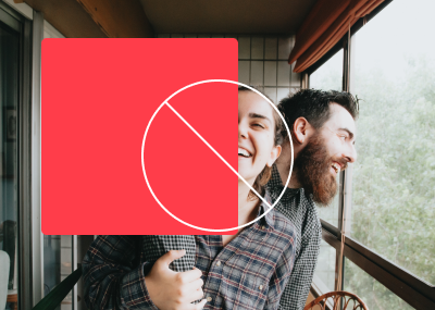
The doorburst is a striking visual element that adds energy and personality to our brand. It can be used on flat colour or be integrated with photography, but be careful not to over-use it. For example, in a document, it could be used on the cover and one or two highlight spreads. It can also be used for presentation covers, pull up banners, adverts and the occasional social media post.

When used on a HELP ruby red background, a white doorburst is preferred.

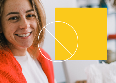
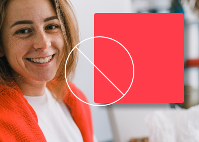
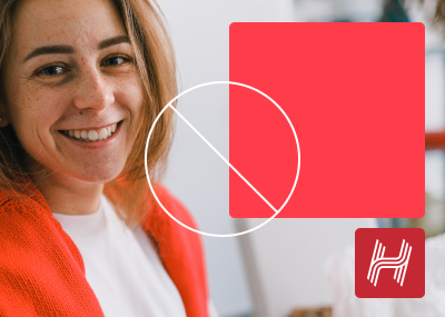
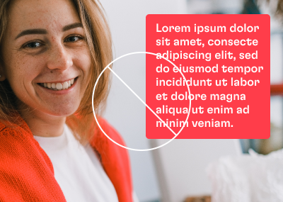
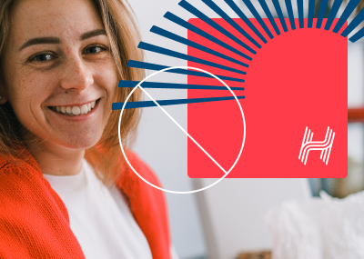
When used on an image, any of the colours from the HELP palette can be used, but the chosen colour should work harmoniously with the image. The doorburst looks most effective when it interacts with the people in the image, deep etching elements from the image, such as a person, and making it look like the doorburst is going behind them.

Download working file

Incorrect doorburst treatment

  1. DON’T put the device over faces.
  2. DON’T use the doorburst in any colour outside the HELP palette.
  3. DON’T alter the line style of the device.
  4. DON’T overlap the doorburst device with text.
  5. DON’T add drop shadows or any other effects to the device.
  6. DON’T overlap the two devices.
  1. Incorrect doorburst treatment
  2. Incorrect doorburst treatment
  3. Incorrect doorburst treatment
  4. Incorrect doorburst treatment
  5. Incorrect doorburst treatment
  6. Incorrect doorburst treatment

If you have any questions regarding the brand guide, please contact:

HELP Marketing Team
E: marketing@helpenterprises.com.au