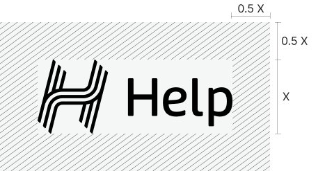
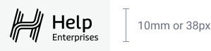
Secondary Logo – Help Enterprises
The full Help Enterprises wordmark may be used in applications where the reader is being introduced to the brand for the first time; and when a more formal approach is required, such as for official letters and business proposals.
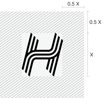
Multiple versions of the Help Enterprises logo have been created for use on different materials and backgrounds.
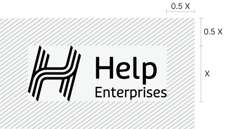
Stacked
- Primary
This version of the logo should only be used on light backgrounds, or those that provide good contrast/legibility.
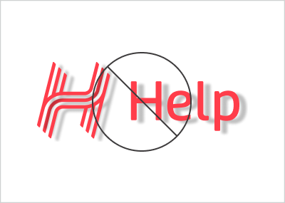
- Reversed
This version of the logo should only be used on backgrounds that provide good contrast/legibility.
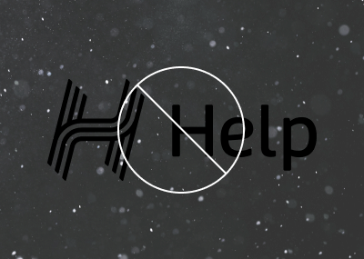
- Black
This version of the logo should only be used on backgrounds that provide good contrast/legibility or where colour use is limited.
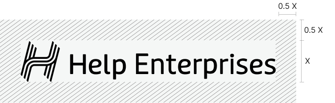
Inline
- Primary
This version of the logo should only be used on light backgrounds, or those that provide good contrast/legibility.
- Reversed
This version of the logo should only be used on backgrounds that provide good contrast/legibility.
- Black
This version of the logo should only be used on backgrounds that provide good contrast/legibility or where colour use is limited.
Download